securly design system
How I developed a design system to bring cohesion and uniformity to a leading EdTech SaaS company
With Securly acquiring new companies every few months and new products to merge into the Securly ecosystem, the design team decided it was time to implement a modular design system to create consistency and efficiency throughout the organization.
Timeline
Ongoing; began 2 years ago and undergoing changes and approvals on a 2-week sprint basis.
Problem
Since there were multiple products that designers were working on at the same time, it was difficult to ensure we were all using the same components. This led to a lot of inconsistency and ultimately a ton of design debt.
We needed to create a component library and design system to ensure a cohesive and scalable source of truth for our product team and a reliable, consistent experience for our users.
We made sure to follow a step-by-step, phased approach for this project, including planning, design, development, testing, and documentation phases.
Planning
The design and engineering teams collaborated to develop a plan on how to deliver components and ensure the designed components matched their developed counterparts. We met on a bi-weekly basis to review and approve components
Design & Discussion
I analyzed our existing component library and noted any changes that needed to be made. I also did an audit of all of our existing design elements being used in our product UIs, making sure to note the discrepancies. I started by designing a new type scale, color palette, and grid system. I then began working on the smallest components (atoms) that could not be broken down further and slowly built out to more complex components.
Development & Testing
I worked very closely with engineering to deliver components one at a time on ZeroHeight. When engineers were finished coding a component I would review it for visual and functional accuracy before approving. If changes were necessary I would follow up after 1-2 days to check in.
Documentation & Implementation
Once a component was complete I would write detailed documentation on how to use the component, its attributes, and any other necessary information. This would be reviewed with the design team and then revised or approved. Another review would take place with the VP of Product before launching.
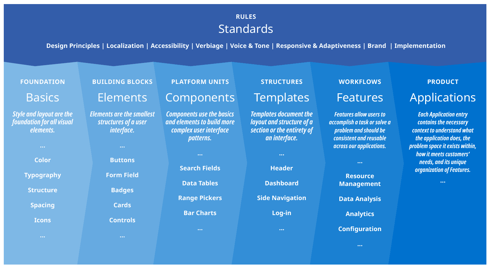
Before jumping into designing components and elements I had to plan out the design system and its structure and standards.
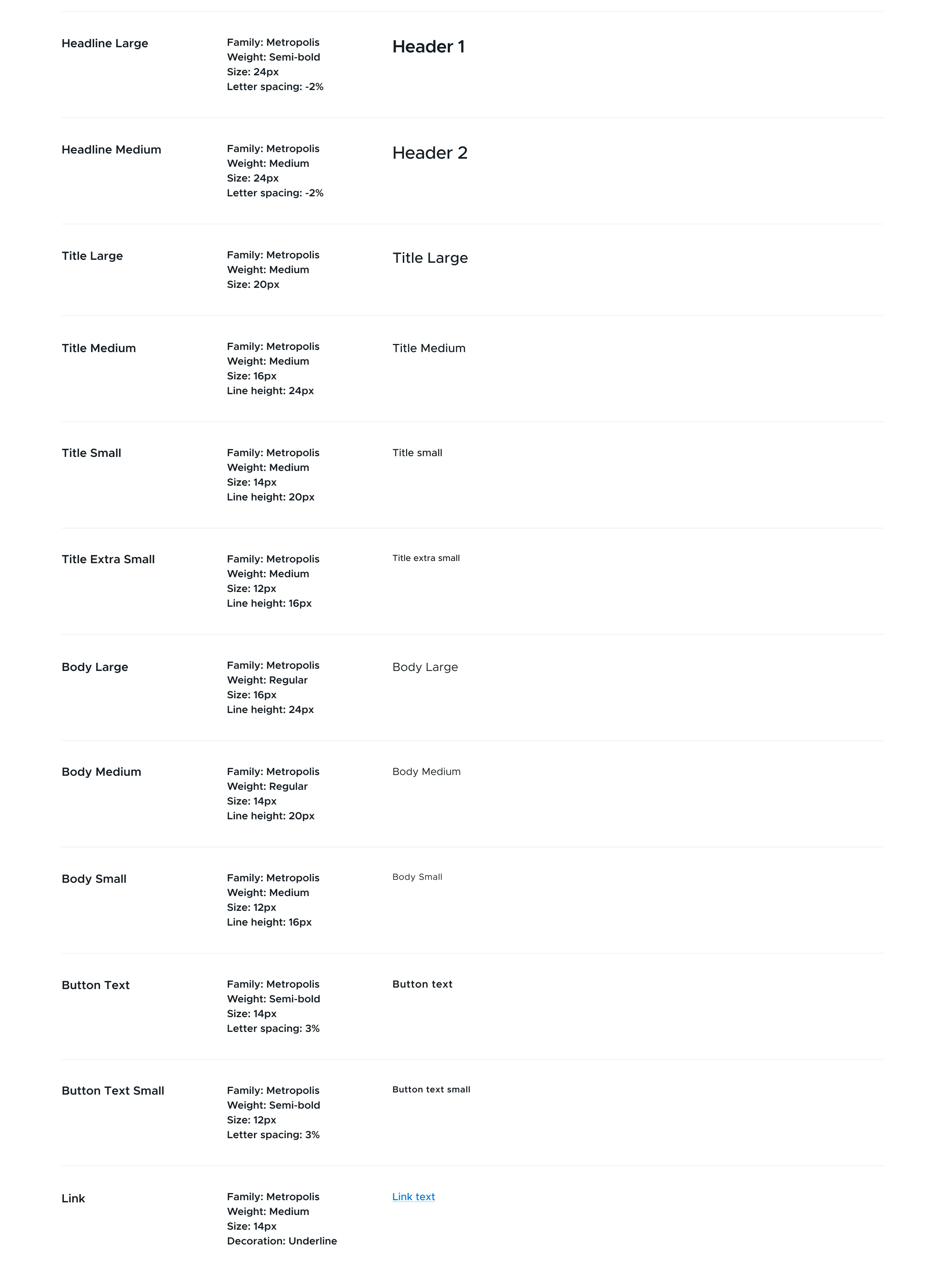
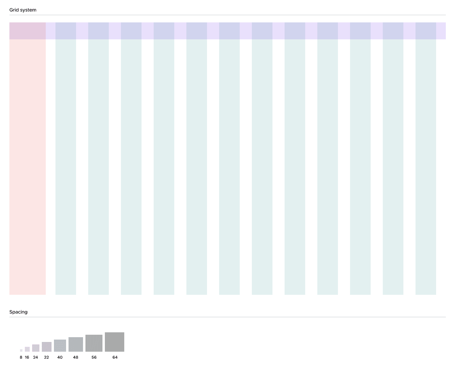
We wanted to have all units inside of the design system divisible by eight or four in some cases. The type scale would reflect that in terms of pixels. Since we were dealing with a UI, the largest heading didn't need to be more than 24px. The base text size we would use for 1 rem on the web was 16px.
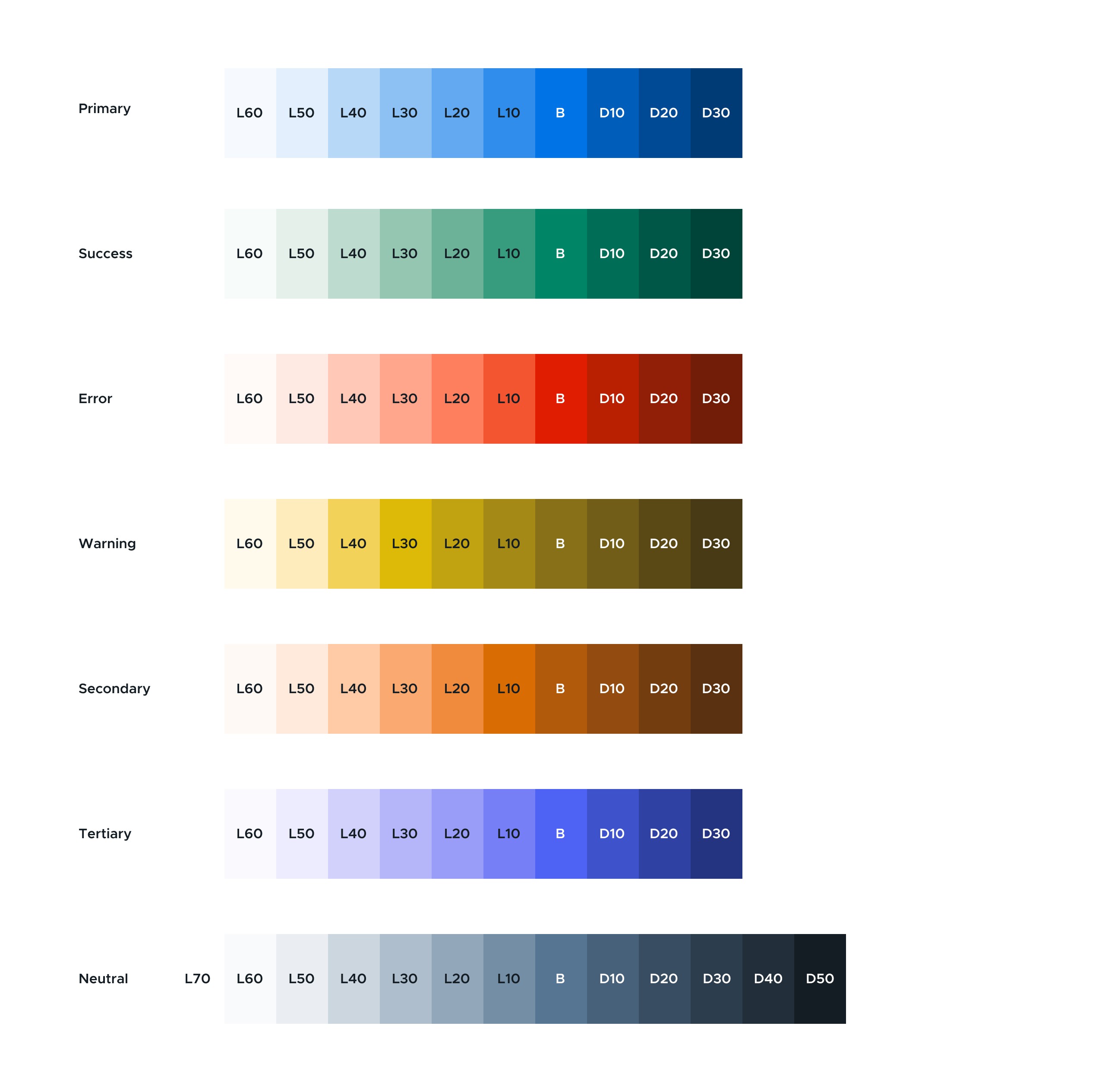
We had a very loose version of a color palette for far too long at Securly. When the brand team went to revise the palette, too many tints and shades were added, making it difficult to define how to use them properly. I pared these down into a more simplified palette with only tints and shades that we could use and define. I also made it top of mind to consider contrast ratio and ensure all colors were the same saturation and hue by using the HSL color scale. The 'B' stands for base and is the primary color used that the others are pulled from.
The existing grid was very loosely defined and based on the Bootstrap grid system. I reconfigured the grid so it could all be subdivided by units of four, making it easy for all future components to fit inside the grid.
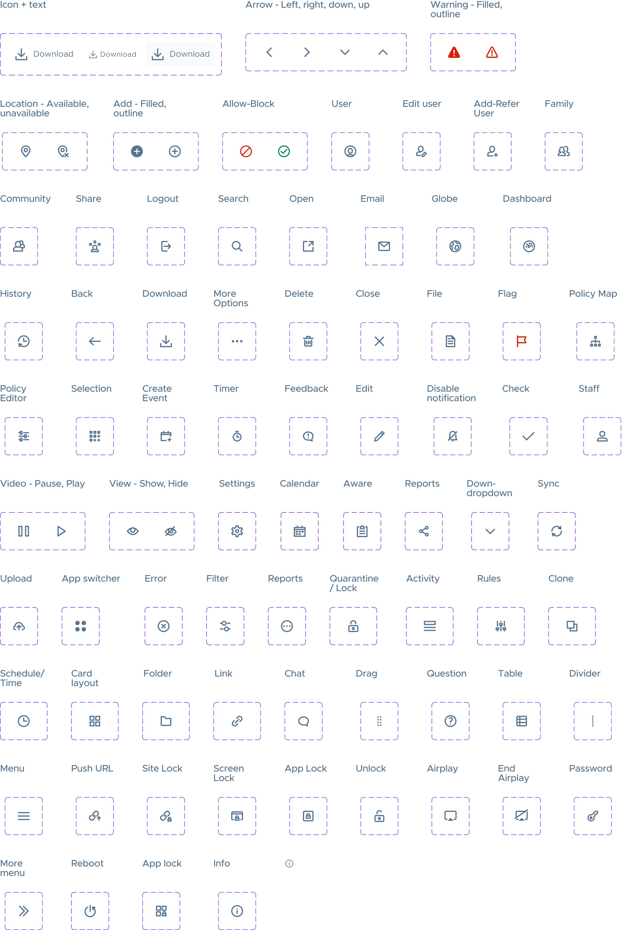
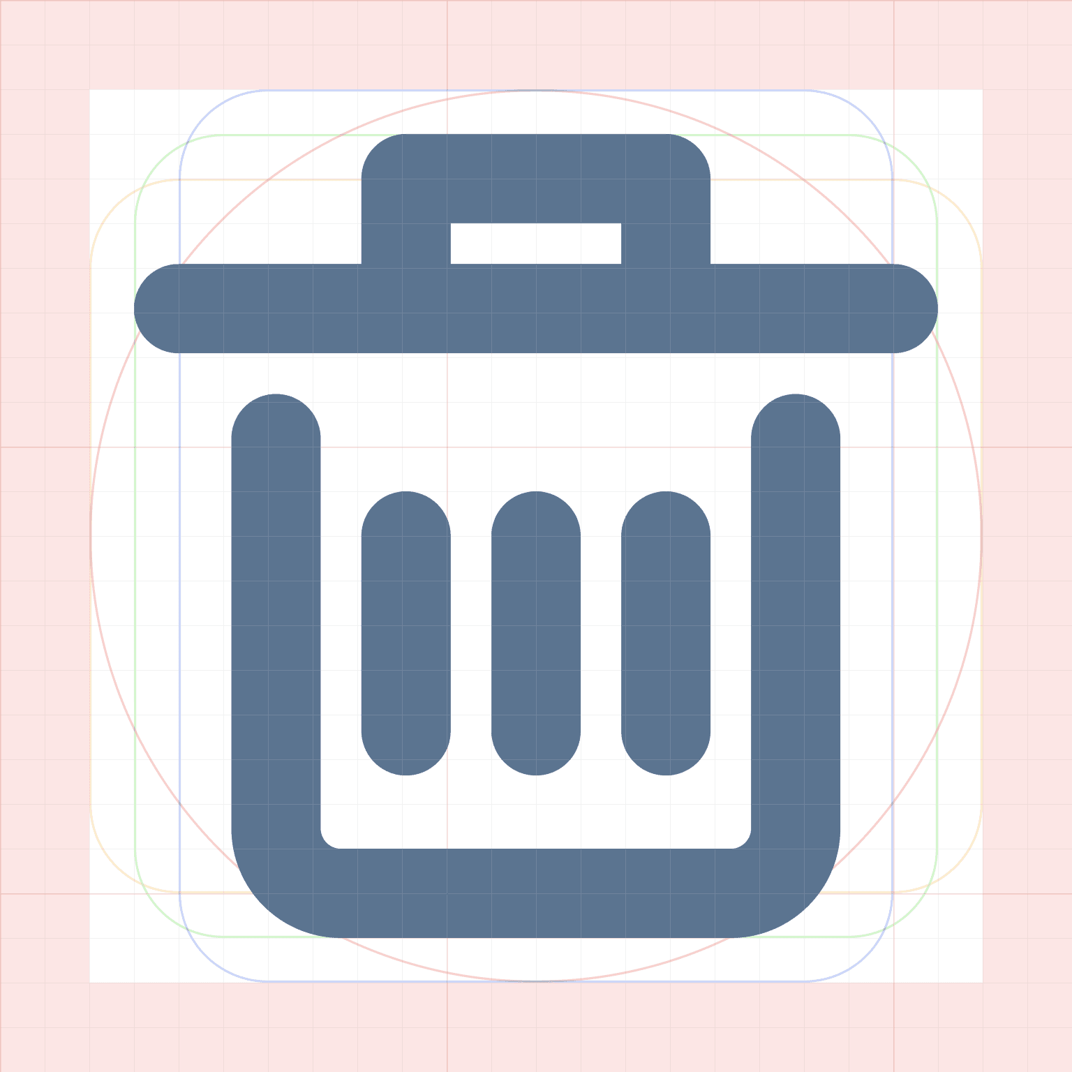
I redesigned all of our existing iconography to fit inside of an icon grid at several different sizes. I also expanded our icon library to make it more complete (small sample pictured).
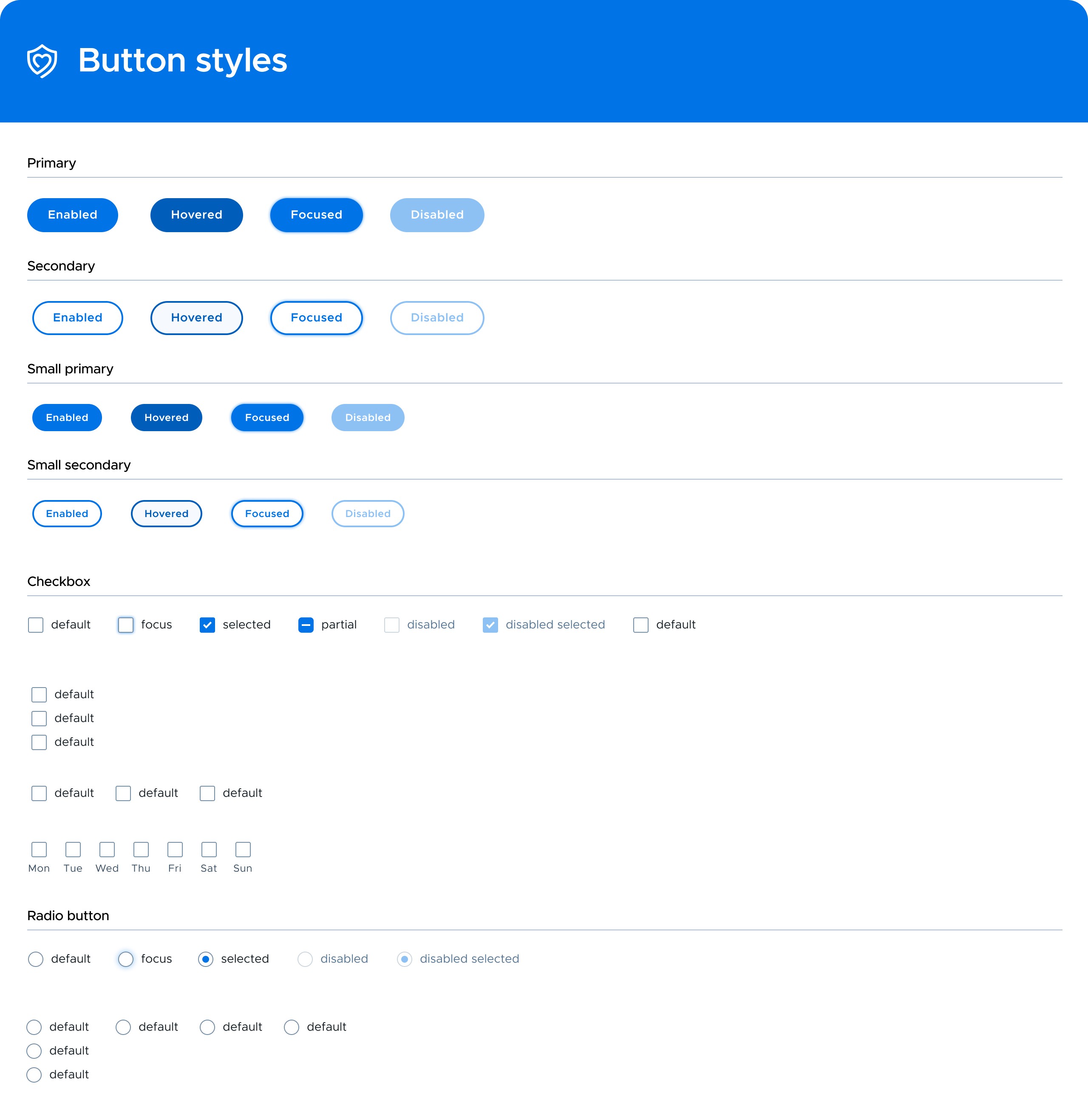
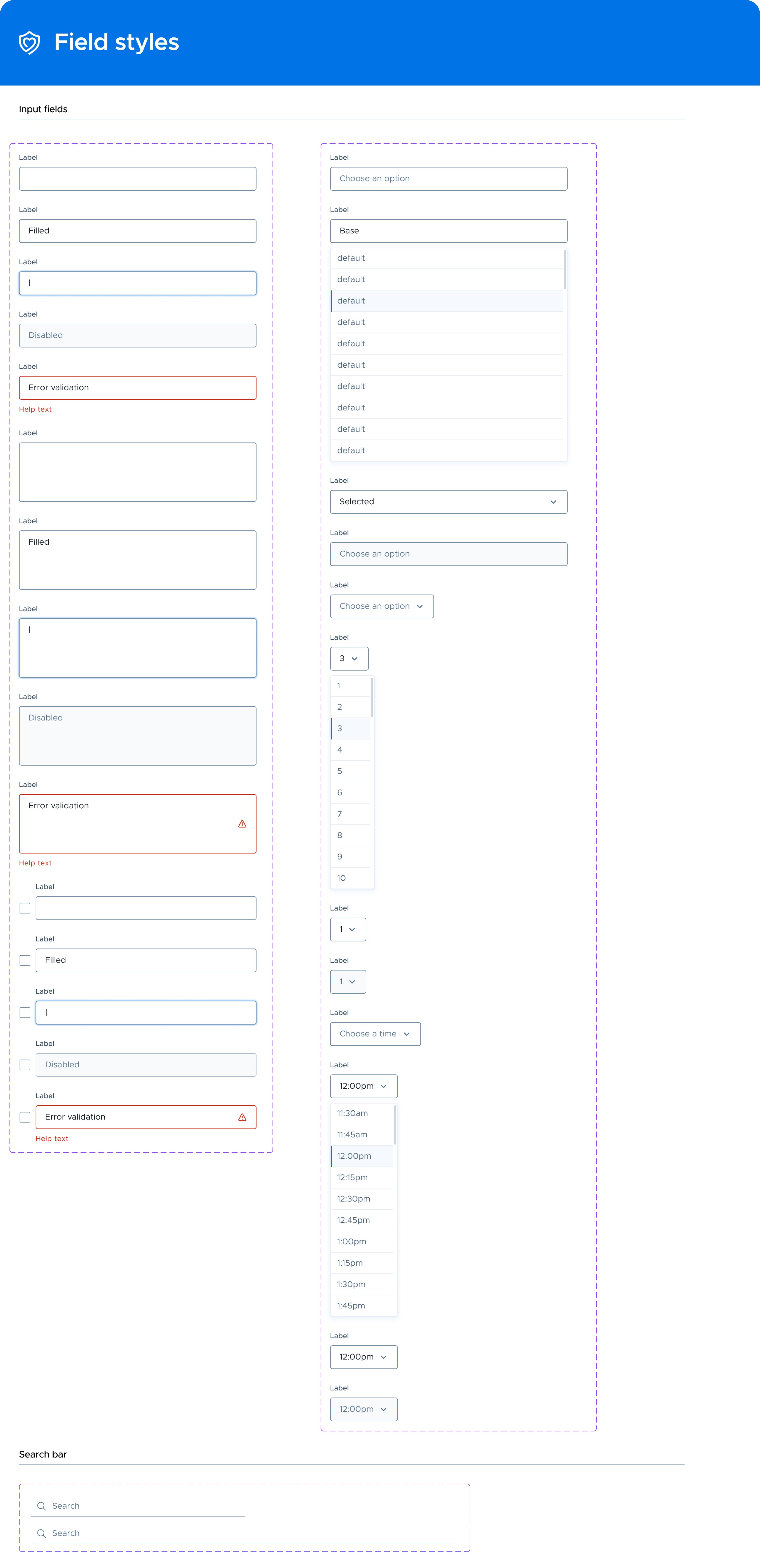
Using the atomic methodology, we began with the basic building blocks (atoms) and built out our component library, slowly getting more and more complex. We started with the button styles and then moved onto form fields, cards, and other small components thats couldn't be broken down further.
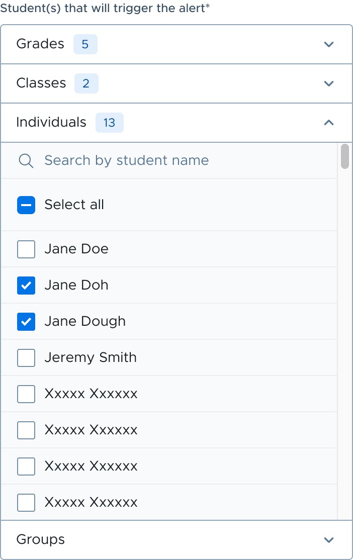
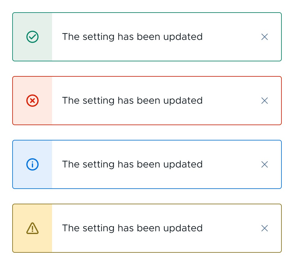
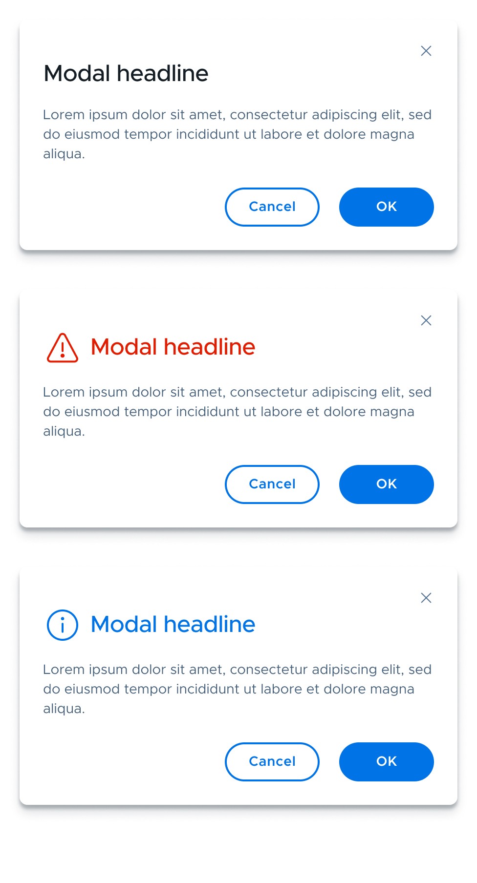
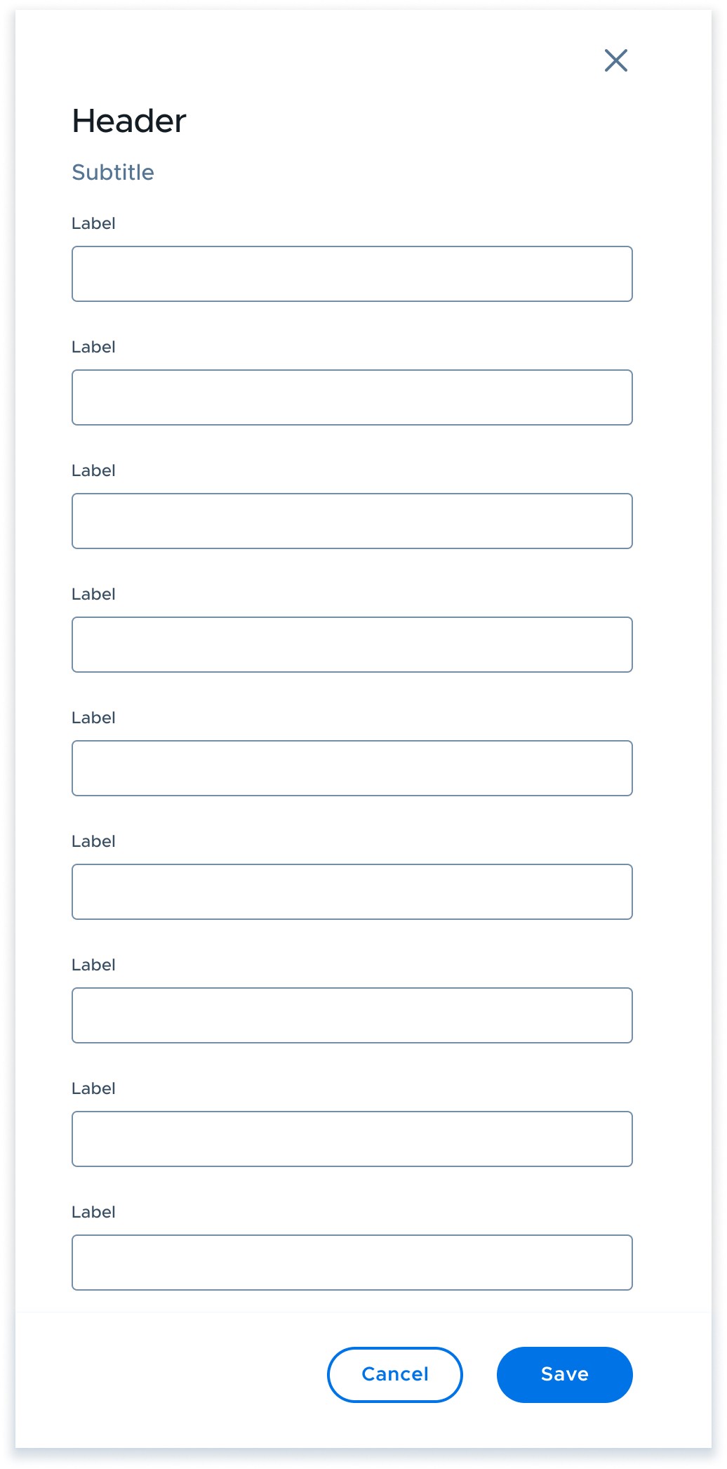
After completing the atoms, I moved on to more complex components (molecules and organisms) by combining atoms to create components like modals, drawers, and tables.
A design system is a continuous a work in progress. Always evolving and changing over time. We are in the process of documenting all of the components on ZeroHeight. The process of getting all components into code is almost complete. The next step will be to templetize entire pages of our UI to make building new designs a snap.
Documentation
All components of the design system are uploaded to the web on ZeroHeight and documented for consumption by designers, developers, and anyone else who needs to use them.
Templetization
When combining more complex components (molecules/organisms) into a template, we are able to quickly build entire pages with these frequently used templates.
Personalization
Customizable components allow users to tailor preferences and priorities to their unique needs.
The investment in the design system has been extremely beneficial for the entire organization, especially designers and engineers. The interactions and processes between these two teams have been greatly improved.
Increased Efficiency
Designers and developers are able to quickly and easily produce finalized artifacts with ease. The time needed to build out entire products and features is greatly reduced due to having the same standards and patterns.
Consistency
The design and engineering teams are fully in lock-step, knowing that the designs produced are one and the same as their coded counterparts.
Scalability
The design system provides a base on which to scale products and the organization as a whole.
Next Project
HP Product Page Redesign
Redefining how a product page is created through a new process
