securly home app
How I redesigned an inefficient app to increase user retention and engagement for thousands of parents
Securly Home is a native iOS and Android app that gives parents the ability to view their children's online activity, set schedules, and manage their internet consumption with a few taps.
Timeline
From explorations to final designs in 3 months while working on multiple projects at the same time
Background
The Securly Home app had become outdated and was in need of a refresh. After combing through the metrics with our product manager to analyze the app data, we discovered we had a lot of monthly active users but a low amount of daily active users and a very high bounce rate. This told us the app was being downloaded and used but wasn't being accessed consistently after that.
We made sure to follow a step-by-step, phased approach for this project, including research, planning, design, development, testing, and optimization phases.
Research & Planning
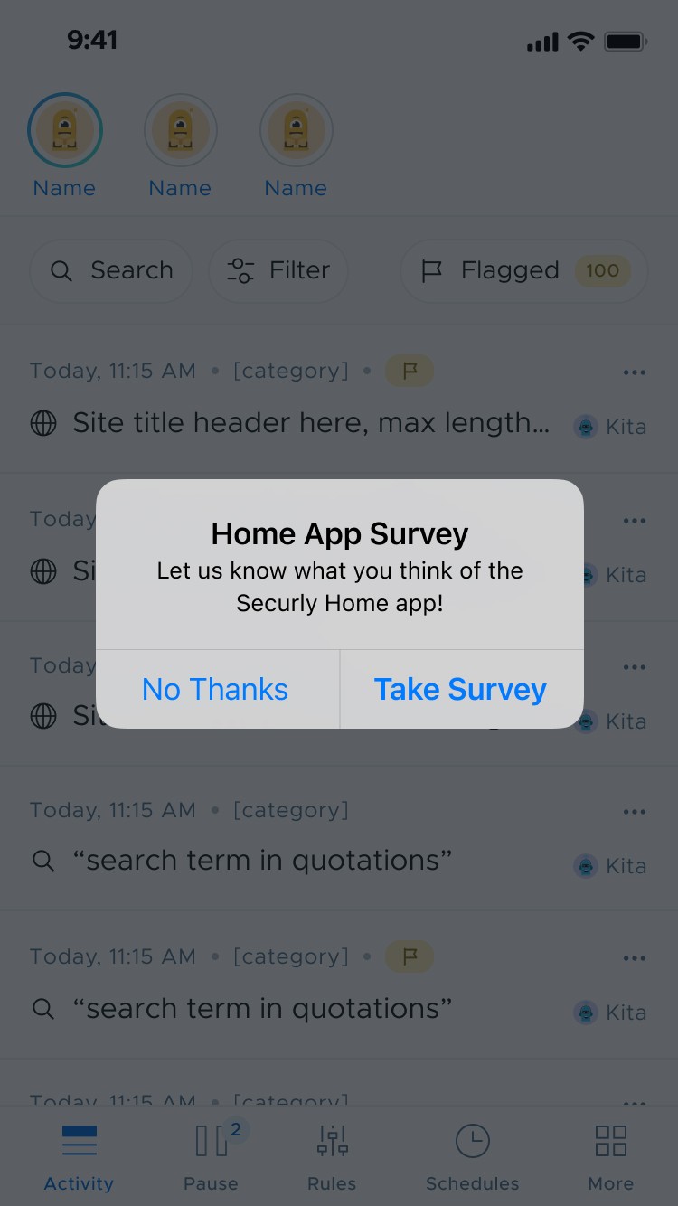
Deployed an in-app survey to identify existing pain points and user preferences. Defined target audience segments and outlined key features based on user needs and market trends.
Design & Prototyping
Collaborated with designers to create intuitive user interfaces and interactive prototypes. Iteratively refined designs based on user feedback to enhance usability and visual appeal.
Development & Implementation
Leveraged agile development methodologies to redesign the Home app from the ground up. Prioritized feature development based on user feedback and technical feasibility. Implemented behavior analytics tracking via Hotjar to analyze user behavior and optimize usability.
Testing & Optimization
Gathered user feedback through beta testing and iteratively optimized the app based on usability metrics and user satisfaction.
After sending out an in app survey, we synthesized our findings into the following:
• Filtering within the activity feed was ambiguous
• Setting up offline schedules was confusing
• Placement of the Pause function led room for user error
• Navigating through the app was not easy, efficient, or intuitive
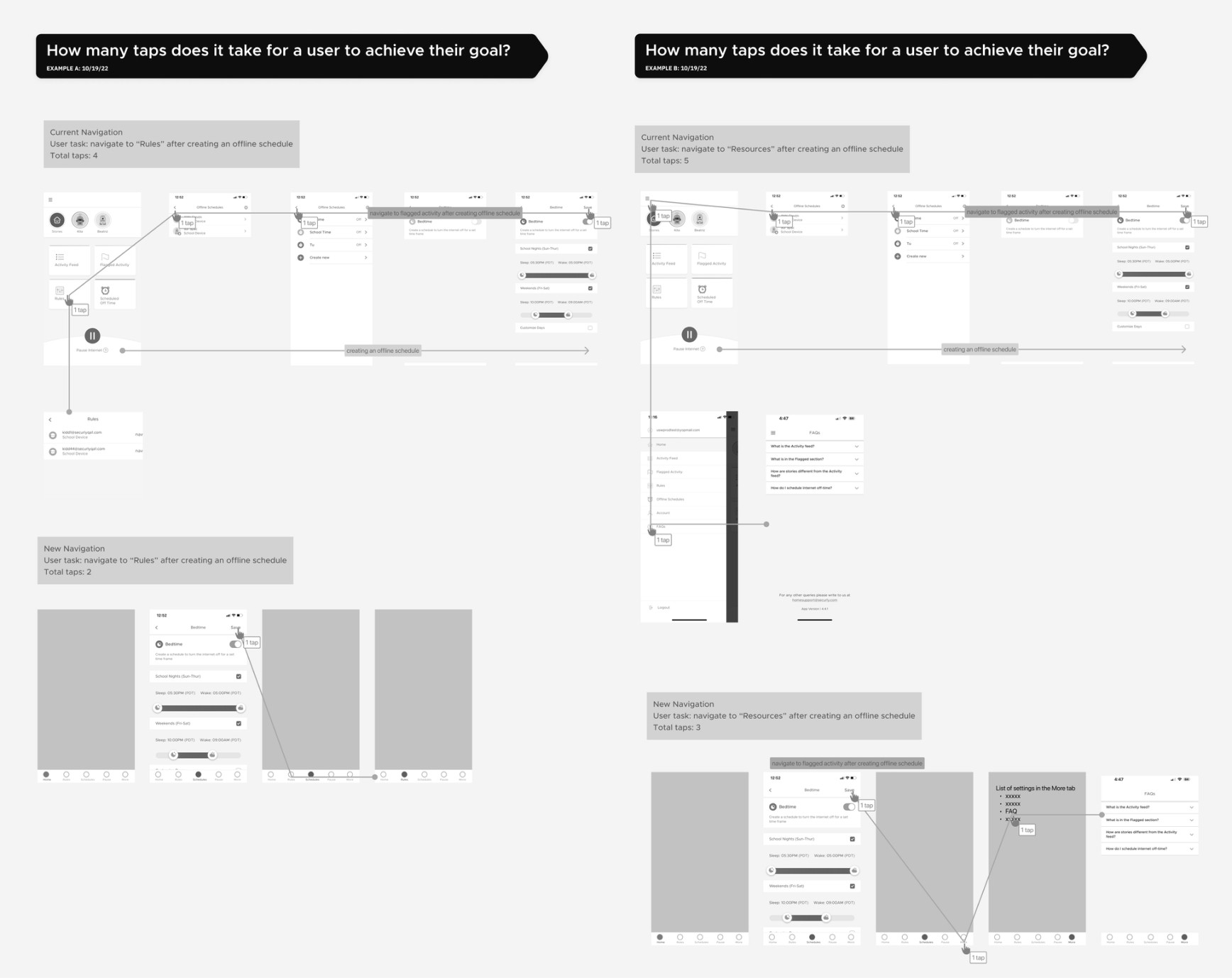
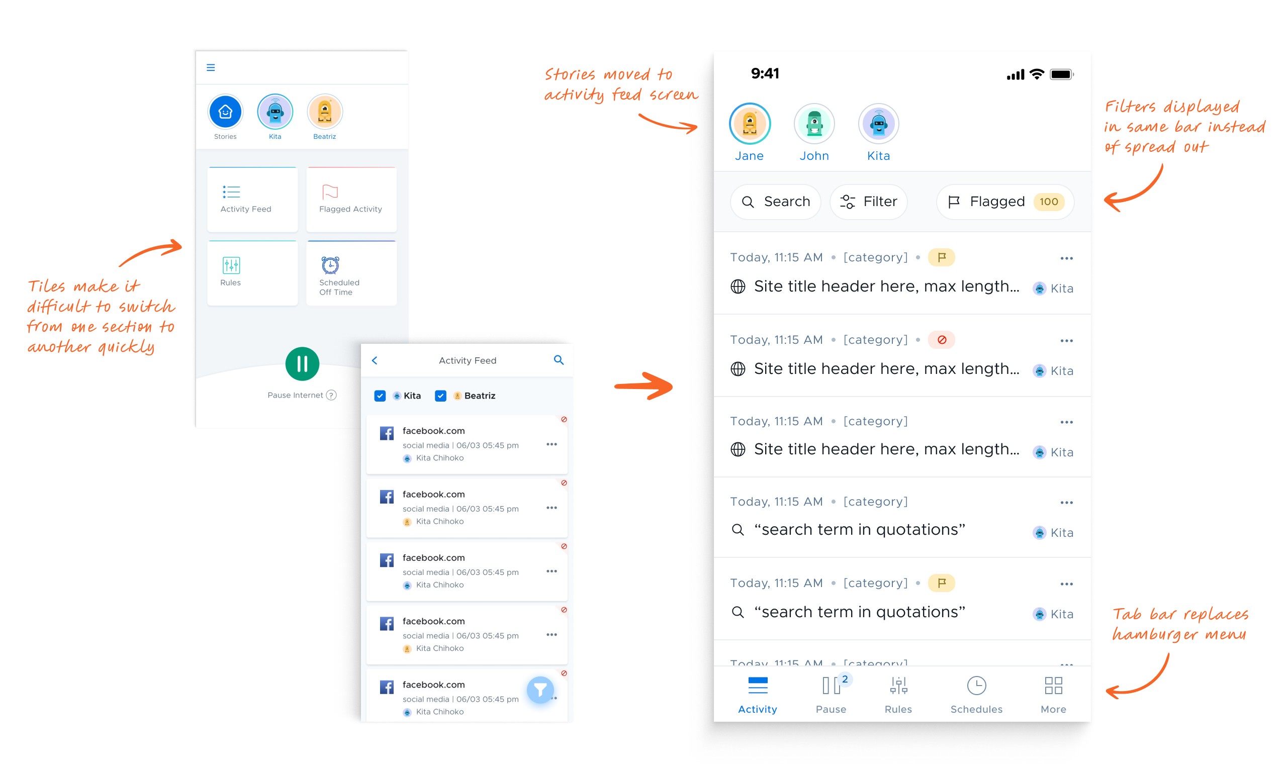
The current navigation was not intuitive and needed to be rethought. The time it took to complete a task in several areas of the app was simply too long. The most impactful decision for reducing the time on task was switching from an outdated hamburger menu to a fixed tab bar. This made any section of the app easily accessible without the need to return to a main menu.
We knew we wanted to change the IA and menu but there were other opportunites for improvement in the app as well:
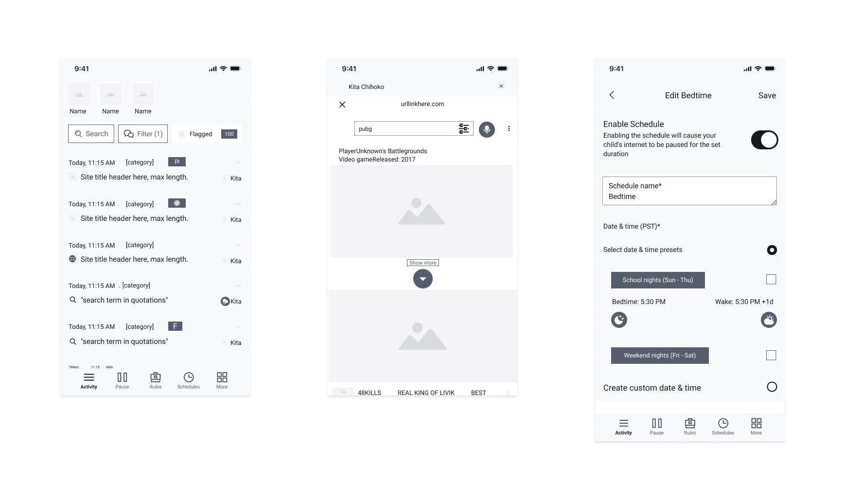
The activity feed screen was using a floating action button for its filters which was obtrusive and not the most elegant solution. We brought the filter bar to the top and made all the filters visible without tapping to reveal them.
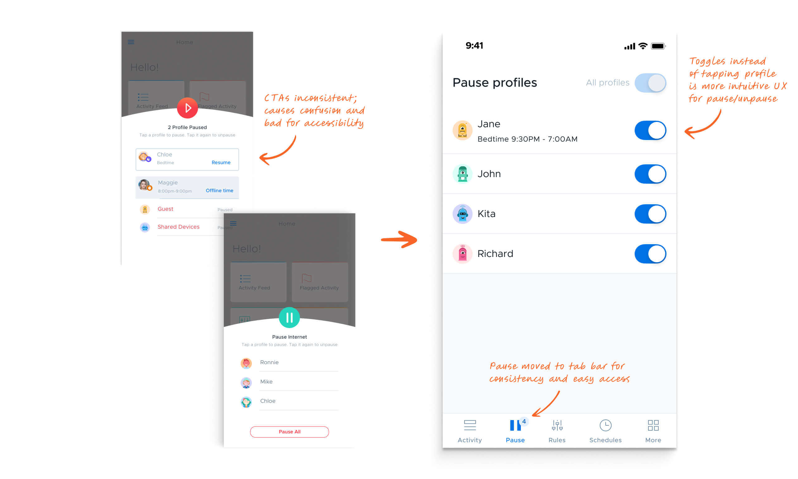
The pause menu was unintuitive. There was no way to clearly tell which profiles were paused or not. By adding toggles next to the profiles this was made clear.
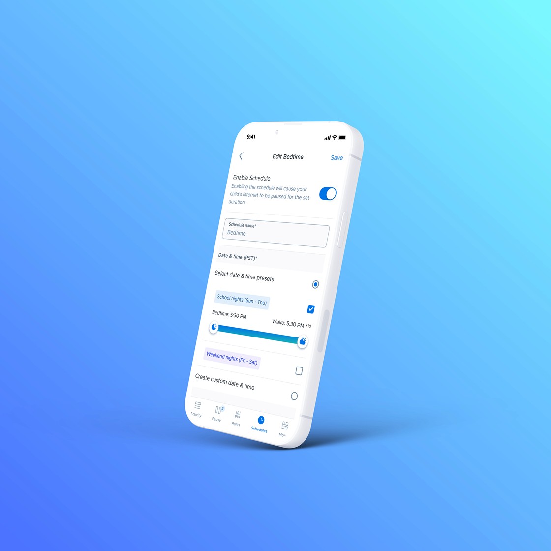
The schedule section was overly complex so we simplified the way schedules were created and edited.
The stories section was not providing enough value and was overly complex to navigate. We simplified the interactions and simplified the categories.
Moving away from a dashboard style landing screen and hamburger menu, we made the activity feed the default screen, saving users from having to tap into the activity feed (which was the most used feature).
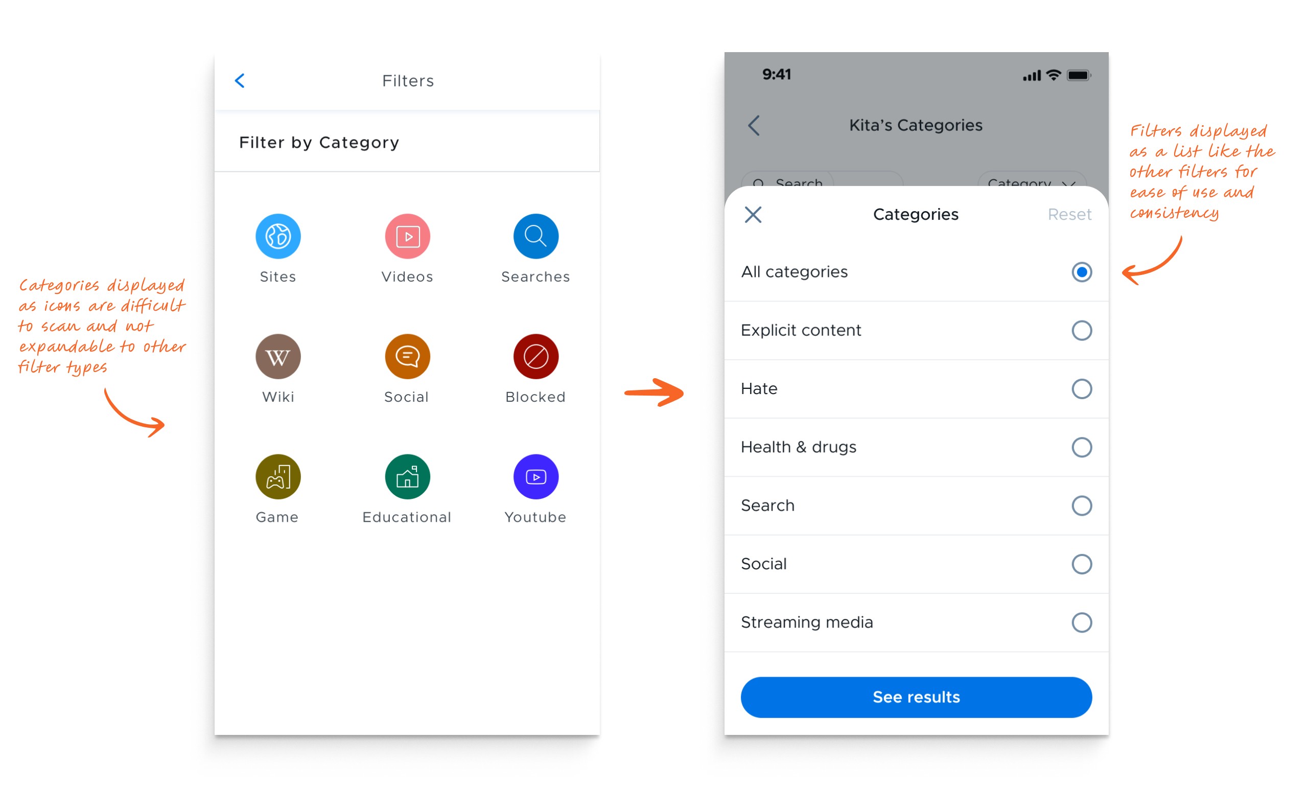
We consolidated the filters into a single bar and surfaced the "flagged" filter so that users could quickly view flagged activity with a single tap. The filter menu was also expanded and made more consistent with the user's mental model.
In the original design, the pause menu was located outside of the tile menu and would slide up in order to pause a child's internet. This was okay, but required the user to be on the home screen to access it.
By moving it to the tab bar, the pause feature could be easily accessed at any time. The interaction for pausing in the original design was also a bit confusing. It required the user to tap the child's name in order to pause or unpause the internet. By switching to toggles, we had a much more intuitive and visual way to show this interaction.
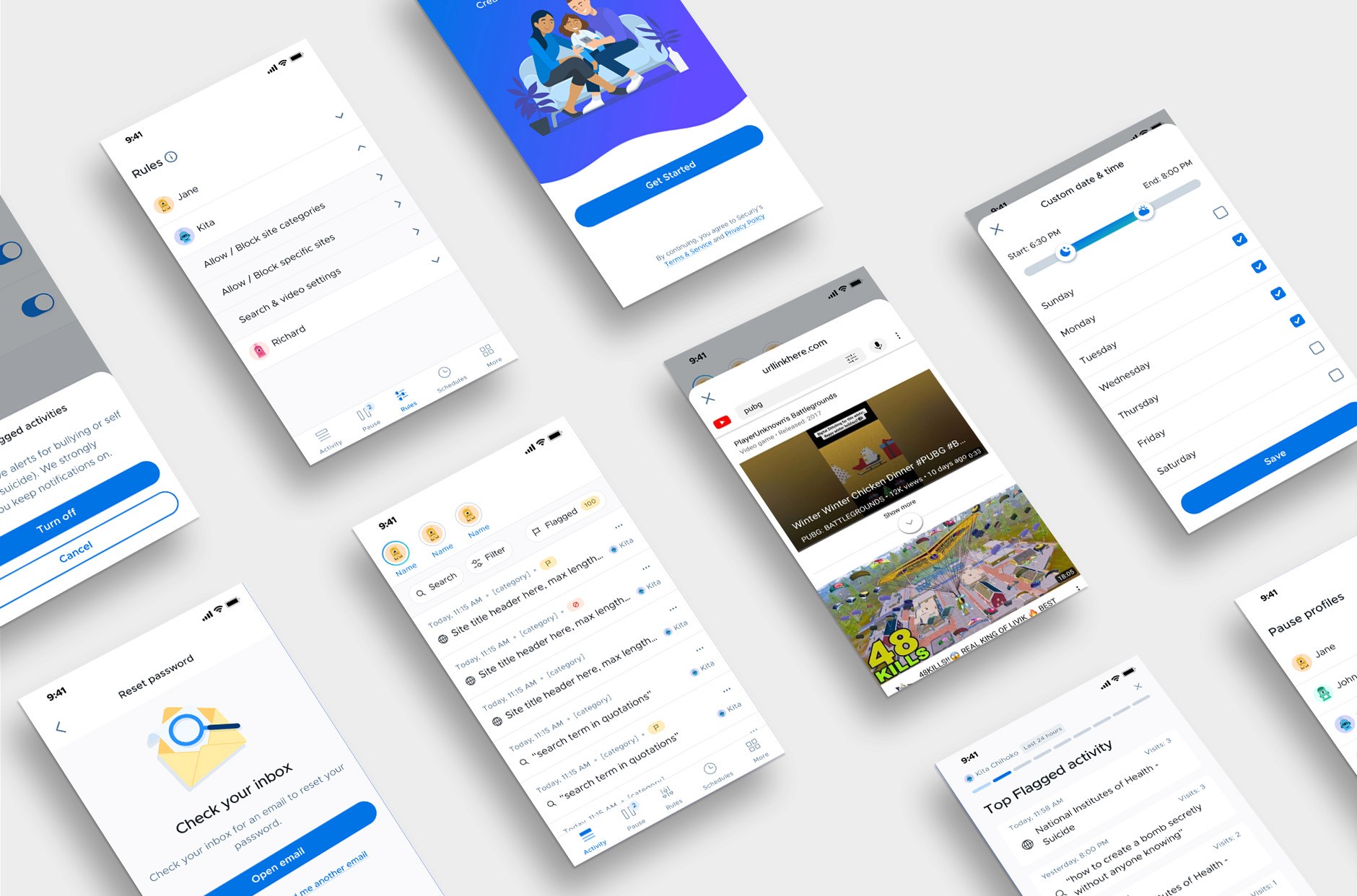
By taking a fresh approach to this redesign and rethinking the information architecture we were able to create a streamlined experience for parents. We saw a huge uptick in engagement for the activity feed and pause menu.
Increased Efficiency
Users report significant time savings and improved productivity through optimized information architecture and ease of use.
Boost in Active Users
We were able to increase 30-day user retention rates by 18% and daily active users by 26%.
Growing User Base
The app quickly gained traction among parents across the country, with a 16% increase in user adoption.
Next Project
Securly Design System
Creating a component library and design system for a B2B education company
